

Dec 14, 2023
Framer
Read More
Impact of Responsive Design: Framer Web Development
Oct 17, 2023
Muhammed Gemi
If you're a designer, you've probably heard about responsive design which is a technique that allows designers to use a single design and make it adapt to different screen sizes. For instance, if your client wants their website to be displayed on mobile phones as well as desktops and laptops, then with responsive web design you can simply adjust the layout of your designs so that they look good on any type of device including mobile phones, desktops or tablets which is crucial for a smooth user experience as well as the SEO performance.
In this post we'll go over what Framer's built-in features have to offer to help you build responsive websites faster:
When designing websites, designers often consider the layout of their designs. The layout of a design is the way in which the elements of the design are arranged on the page. There are two main types of layouts: fixed and fluid.
For example, if you have a fixed-width site (which means that all content is contained within set dimensions), then this means that no matter what resolution your user's device has or how much they zoom in or out on their browser window, everything will always fit perfectly within those boundaries because they're set at specific sizes (for example 1024x768). Fixed-width sites can look good but can also feel very restrictive at times due to their limited flexibility; however, there may be instances when having one might be appropriate for certain projects such as creating an online store where everything needs to be placed neatly next to each other without any room for error or misalignment and positioning issues between elements such as images/text/etc...
It is a technique that allows designers to use a single design and make it adapt to different screen sizes. It's also known as fluid design, dynamic and adaptive layout and responsive web design.
It's very common these days for websites to have their own unique style sheets which will adjust themselves according to the size of your browser window or device you're using (iPad vs Android phone). This means that if you resize your browser window on your desktop computer - your webpage will automatically change its layout so that everything looks good at whatever size it has been resized to!
Framer is not a design tool like Figma but a tool for creating interactive websites.
Nice animation and interactions such as hover effects, scroll transforms, scroll speed, etc.
Framer has built-in features that help you resize or move objects on the canvas easily so they look good on any screen size or orientation without any extra work from your side.
Framer has a built-in feature that allows you to resize or move objects on the canvas easily so they look good on any screen size or orientation without any extra work from your side.
You can use this feature by simply clicking on an object, and then dragging its handles (corners) to make it larger or smaller, depending on your needs. The same goes for moving objects around: just click and drag them where they need to be moved!
In comparison to Webflow, it is much easier and faster to develop websites in Framer.
He is a web designer and front-end developer. Ethan Marcotte was born in 1979 in New Hampshire, USA. He graduated from the University of Virginia with a degree in English Literature before moving on to work as an architect for several years during which time he became interested in coding HTML pages and creating websites for clients based on their needs rather than his own preferences or tastes.
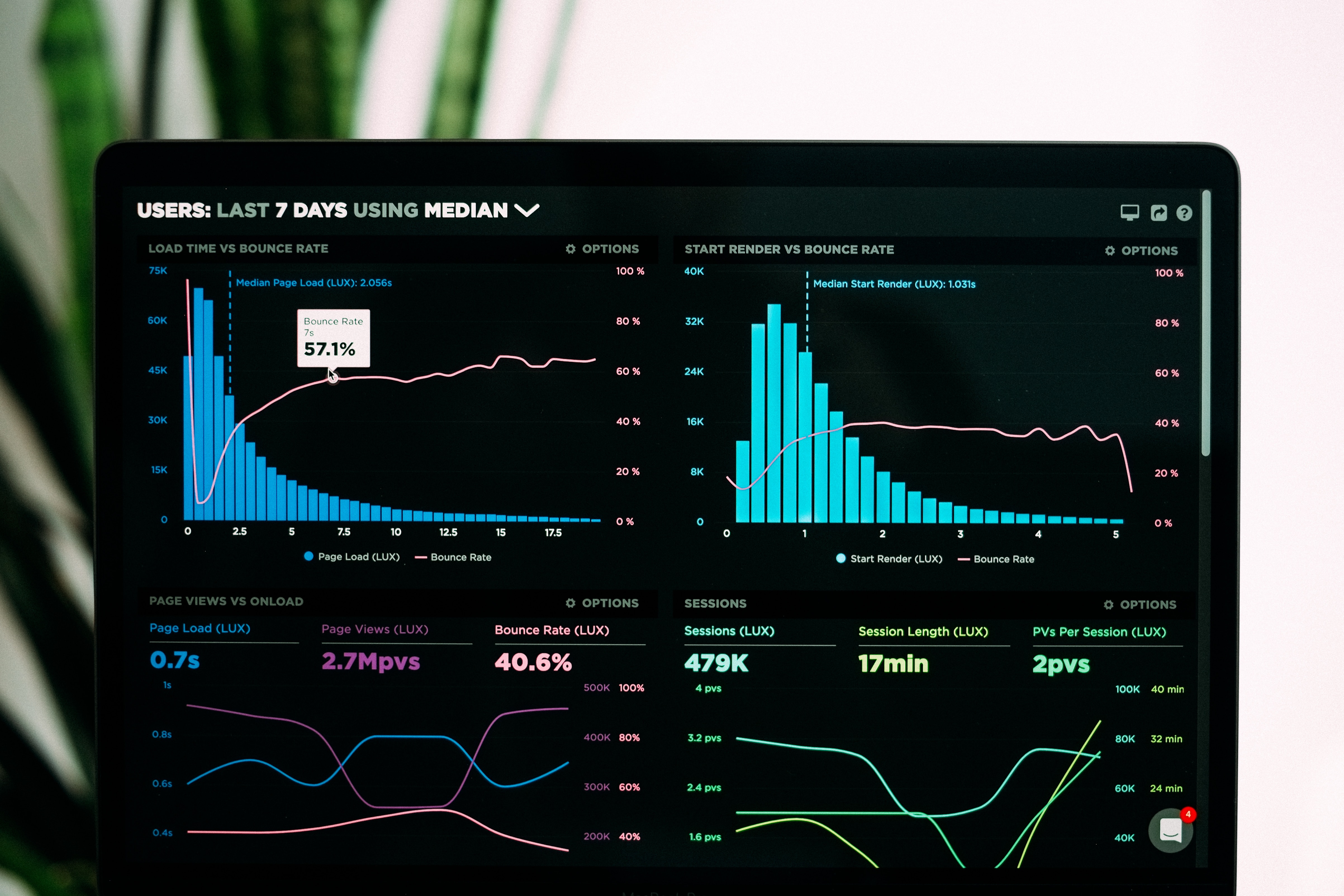
Responsive web design is an approach to web development that makes websites render well on all devices, from mobile phones to desktop computers, and even to tablets.
Responsible designers use this technique to create a single version of their website and then adapt it automatically to fit any screen size or orientation. Responsive design also ensures that your site will look good regardless of what browser is being used; even if you're using Internet Explorer 9 (which has been unsupported since 2014), your responsive site will still work just fine!
A responsive website is a great way to reach your audience. It allows you to create one design that will work on any type of device without having to worry about how it will look or if the user will be able to access all of your content. With Framer, you can create your interactive and responsive website in a short amount of time. If you don't have any time to create it, contact us and we will design and develop your website.
We have a team of verified framer experts. Get in touch now for your web design and web development projects. We are the #1 Framer Web Design & Development Agency check our Framer Web Design & Development services.